Behind the build
How This Site Is Designed: Pages, Keywords, Design System and Internal Links
How this site is put together: why each tool gets its own page, how the seven are made different from one another, and where every internal link points.
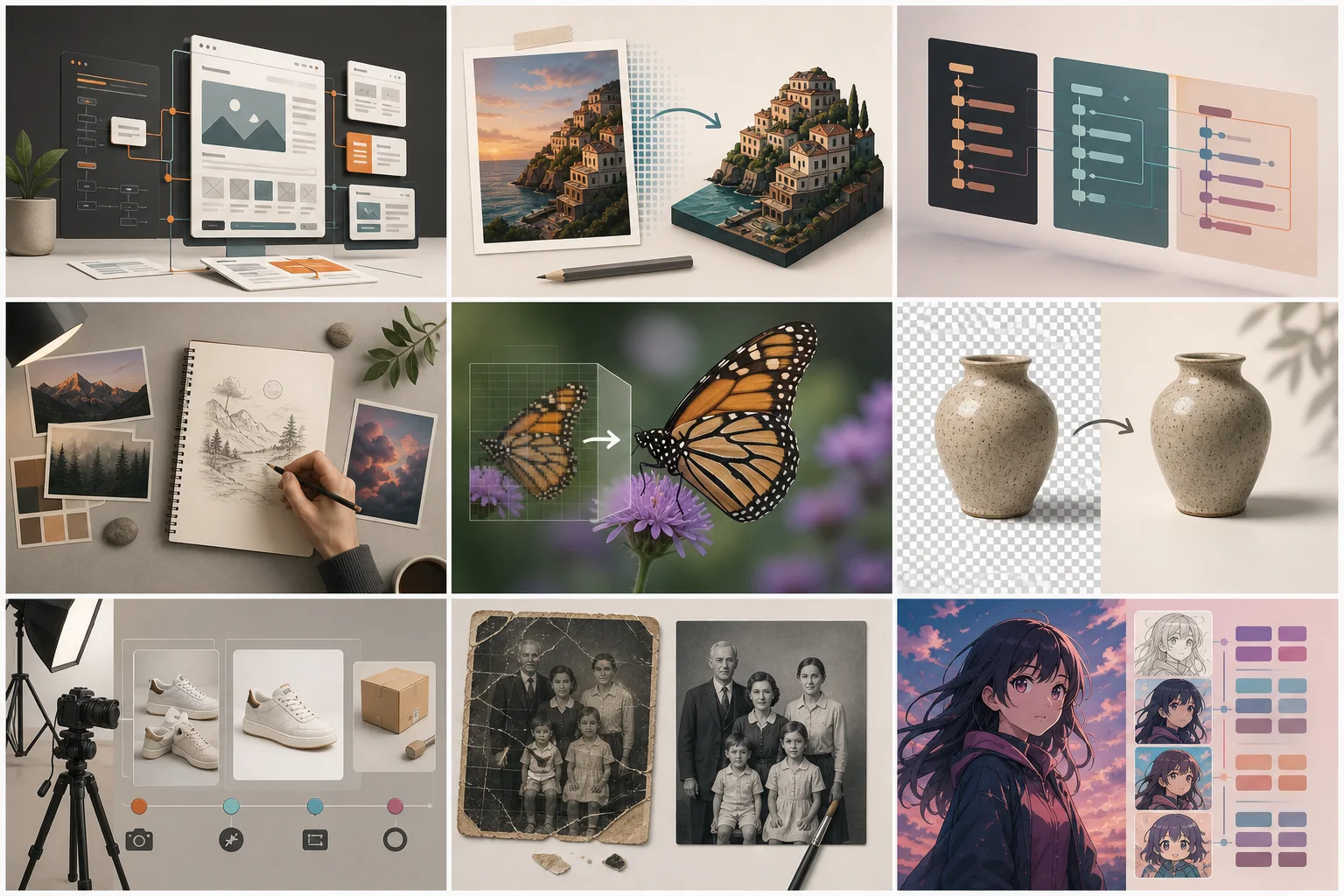
This article is the design document for the site you are reading. It covers four things: what each page is for, how the pages are deliberately made different from one another, the rules the interface follows, and how everything links together. We publish it for the same reason we publish our limits — a tool you are going to upload your photos to should be legible from the outside.
One page per job, at the root of the domain
Every capability gets exactly one page, and that page lives one level down from the domain: remove background from image, upscale image, AI photo enhancer. No /tools/ prefix, no abbreviations. The URL is the exact phrase people type, because in this category the search results are still full of tiny exact-match domains — the signal has not stopped working.
The rule that follows from that is stricter than it sounds: two pages may never target the same phrase. When they do, the search engine has to pick one and the ranking strength gets split between them. We made that exact mistake early on — the home page and the image to prompt page carried the same title for a while. The fix was to give the home page the broad AI image editor topic, leave image to prompt on its own tool page, and keep the operational image workspace out of the index.
| Page | The phrase it owns | What it is for |
|---|---|---|
| /image-to-prompt | image to prompt | Read a picture, write the prompt behind it |
| /image-prompt-generator | image prompt generator | Write a prompt from an idea |
| /remove-background-from-image | remove background from image | Cut-out to transparent PNG |
| /upscale-image | upscale image | Enlarge with reconstructed detail |
| /ai-photo-enhancer | ai photo enhancer | Repair and restore photographs |
| /ai-product-photo | ai product photo | Studio scenes for listings |
| /ai-anime-generator | ai anime generator | Anime images, free, no sign-up |
| / | ai image editor | Edit images with a visible, protected plan |
| /image-agent | noindex workspace | Describe the outcome, then review and run the steps |
Seven tools, four kinds of page
The first version of these pages shared one template: upload box, how it works, use cases, FAQ. It was efficient and it was wrong. What someone wants from a background remover and what they want from a product photo generator are not the same shape of want, and a page that ignores the difference converts badly — and reads, to a search engine comparing pages, like the same page seven times.
- Errand pages — remove background, upscale. The first screen is nothing but a drop zone and a few sample images. Options appear after the upload, because before the upload they are noise.
- Workbench pages — image to prompt, prompt generator. Format, target model and output language are the point, so they are on the first screen next to the input.
- Trust pages — the photo enhancer. Two modes, and a permanent warning next to face repair telling you it can make a low-resolution face stop looking like the person. People restoring family photos need candour more than they need a bigger number.
- Storefront pages — product photos for ecommerce. The first screen is a gallery of scenes, not an upload box, because a seller decides what they want the photo to look like before they decide to try it.
The written sections differ too. Headings on each page are phrased as the sentences people actually search — "Fix pixelated and low-resolution photos" rather than "How it works" — so the same section slot carries different meaning from page to page instead of the same boilerplate.
One design system, seven identities
Every page shares one set of tokens and one type scale. What changes per page is a single accent hue, swapped by a data attribute on the page wrapper: orange for image to prompt, green for background removal, blue for upscaling, amber for the enhancer, violet for product photos, pink for anime, teal for the prompt generator. Everything else — surfaces, borders, spacing, type — is identical, so the pages feel like one product with seven rooms rather than seven products.
- Headings are never bold. Weight 400–600 with negative letter-spacing reads more precise than 700 ever does.
- Hairline borders instead of shadows. Depth comes from a 1px line and a grid gap, not from a stack of blurs.
- Numbers are monospaced. Credit counts, dimensions, scale factors and format names are data, not prose.
- Touch targets are at least 44px everywhere, including chips and footer links. Most of this traffic is on a phone.
- Dark mode uses a deep graphite canvas (#0F1014), not pure black, so generated images and video frames keep their colour while borders remain visible.
Structured data only describes what you can see
Each tool page emits SoftwareApplication, FAQPage and BreadcrumbList; pages with real numbered steps also emit HowTo. All of it is generated from the same constants the page renders, so the FAQ in the markup is the FAQ on the screen, question for question. Marking up ten questions and showing four is the kind of thing that earns a manual penalty, and it is an easy mistake to make when the markup is maintained separately from the content.
It is also rendered on the server rather than injected after hydration. Rich results should not depend on a second rendering pass happening at all.
Where the links go
Internal links are the only ranking lever on a site like this that costs nothing, so they are designed rather than sprinkled. The home page links to all seven tools. Each tool page carries a sibling bar to two related tools, chosen by what people actually do next — background removal sends you to studio scenes for a product shot, the upscaler sends you to the enhancer. Every article links to the pages it supports, and the tool pages do not link back into individual articles, which keeps the flow of authority pointed at the pages that need to rank.
Anchor text rotates on purpose. Links to the upscaler read "upscale image" in one place, "AI image upscaler" in another, "enlarge image" in a third. A site where every link to a page uses the identical phrase looks assembled rather than written, and the variants are themselves phrases people search.
What we deliberately do not do
- No pages generated from a template with a word swapped. A page gets built when it has something specific to say — which is why there is no page per anime style and no page per upscale factor.
- No decorative sample images standing in for real output. The proof section on the image to prompt page is empty until we have genuine before-and-after pairs to put there, because its entire claim is that the generated prompt reproduces the picture.
- No adult content, face swaps or celebrity generation. That is a product decision first, but it also makes the anime tool something you can open at work.
- No fake urgency in pricing, and no credit expiry on packs people paid for.
Read the rest of it
The same reasoning is applied to what a run costs and what is free — that is on the credits and plans page, including the parts we do not charge for. If you want the short version of who is behind this and how the comparisons are made, that is about the team. And if you would rather not pick a tool at all, describe the result you want and let the agent plan the steps.